
Redesign of the Nedbank Greenbacks app menu
A card sorting exercise followed by a redesign of the menu for the Nedbank loyalty & rewards app.
January 2020
Responsibilities: Interaction design, Information architecture, Card sorting, Wireframing, Visual / UI design, Content development and Prototyping.

What is Greenbacks?
Greenbacks was a traditional loyalty and rewards programme for Nedbank, but have been evolving into a behavioural money management programme. What this means is that it would guide and help customers to make better financial choices through a gamified experience.
When customers improve their behaviour, they are rewarded. The same way that Discovery rewards you for going to the gym, they would reward you for managing your money well. These behaviours are for a variety of financial elements such as transacting, spending, saving, debt repayments etc.
Below I unpack the work for restructuring the main and secondary navigations of the app in order to improve the findability of all the features. You can also read about the heuristic assessment and the improvements on the app flows in this project.
Why the need to unpack or restructure the current menus?
Considering both the magnitude* of features inside the app as well as the relationships between different features, it’s necessary for us consider where these features should sit in either the main or secondary menu.
Without proper navigation, users are unable to navigate the app easily.
A card sorting exercise was completed to understand what people’s assumptions were and how they would structure these menus.
* There are roughly 20 features in the Greenbacks app, not yet considering any new future features.
Some of these are featured on the home page while others need to be considered in the menus.
If you’re interested in seeing the research and results of the card sorting exercise, or want to view the final menu, use these quick links to skip to those sections.
Menu type and placement
The placement /order inside each menu is also crucial.

Main menu
This menu only has 4 placements available which requires careful consideration due to the importance of the features, the size of the menu as well as the ease-of-click for this horizontal menu.

Secondary menu
This is a scrollable list of 12 items (portrait). Considerations need to be made for the quantity of items and their hierarchy.
Items/features to be sorted
Listed alphabetically below
About the programme
Competitions
Contact us
Coupons
Home
Levels & packages
Log out
Messages/ notifications
My cart
Offers
Partners
Shop
Stores
Surveys
Terms & Conditions
Transactions
Original menu
About the menus
The placement and style of main and secondary menu

Card sorting exercise
Methodology
The card sorting exercise was conducted on 05 Dec 2019.
It was created using Optimal Workshop. This digital platform:
Allowed the exercise to take place remotely.
Enabled the participants to submit the results anonymously,
Enabled the participants to complete the exercise on their own time and pace,
Recorded the results automatically, making the findings compilation quicker.
Invitations were sent to 10 participants to anonymously submit results. These consisted of a variety of people such as designers, creative directors, copy writers, project managers, behavioural scientists, business analysts, etc.
About the participants


Results for categories
From the view of the menu / categories, which cards were sorted into each (along with their frequency).

Results for cards
From the view of each item/ card, where was this sorted into.

Results for placement

The number of times each card was placed in a certain menu.

The percentage of participants who sorted each card into the corresponding category.
Summary of findings
Ranked in terms of placement
Main menu
Home
Offers
Shop
Levels & packagesPartners
Coupons
About the programme
Messages / notifications
My cart
Contact us
Log out
More
Secondary menu
About the programme
Coupons
Levels & packages
Affinities
Stores
Messages / notifications
My cart
Transactions
Competitions
Surveys
Partners
Contact us
Terms and Conditions
Log out
Structuring the new menu
After completing the card sorting exercise and evaluating some of the insights, further investigations took place.
Features that were removed:
Stores as a feature was removed from the app all-together. We decided to leverage off the capability of Waze or Google Maps for offers that use a physical store redemption.
The Partners page is a list of partners from the “Offer" & “Shop" sections but does not add any direct value to the customer, unlike “Offers” and “Shop” where the customer gets deals / products. The feature itself is being removed from the app.
Features that merged with others:
Coupons have merged with the Offer flow, thus not needing its own placement in the menu.
Transactions was moved to the Profile section where it now sits with the account information and balances. It no longer needs to be in the menu itself.
My cart sits prominently inside the Store section (which is situated in the main menu already).
Additional adjustments made:
Levels & packages has prominent placement as a widget on the home page. Although it is an important item to list in the menu itself, it does not need to be featured on 2 main menu items. It thus moved to the secondary menu.
Affinities was added as a menu item. It fits in with home page structure: About the programme followed by Levels and packages then Affinities.
Messages / notifications has moved to the top bar next to Profile to align with the Money App (the main transactional app for the same bank).
The main menu now only has 4 spots, including the More tab. If the feature list grows it can expand to listing 5 items as per the initial scope of the menu.

Home page structure (New versus return user)
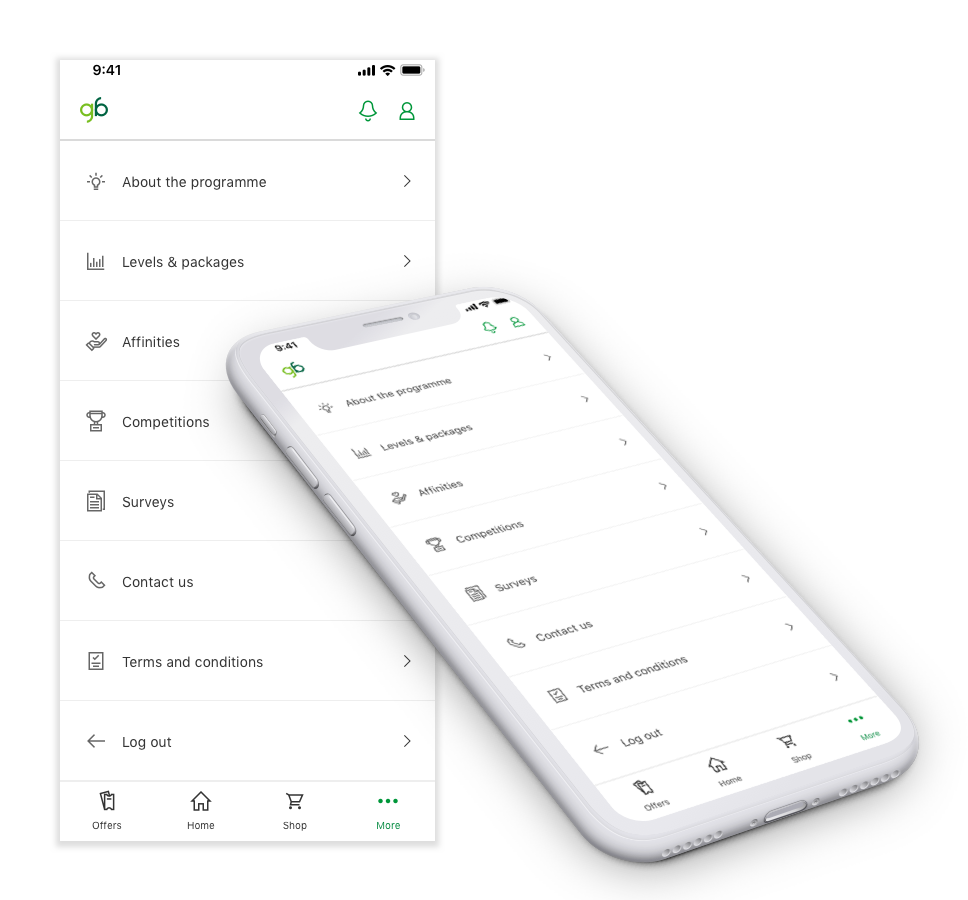
Final menu structure
Main
Home
Offers
Shop
More
Secondary
About the programme
Levels & packages
Affinities
Competitions
Surveys
Contact us
Terms and Conditions
Log out
In addition to updating the placement of the features, improvements were also made to the styling and iconography of both menus.
Final design
Side note:
When the list grows bigger, we’re making the “Log out” button static along with the menu at the bottom. All items in the list will scroll behind Log out.