

Online account applications
Creating self-service applications for financial products like a current account, overdraft or investment product.
July 2018 - May 2019
Responsibilities: Interaction design, Wireframing, Content development, Assisting in Visual / UI design and Prototyping.
Context
Industry
Financial services - banking sector. New to agile. Located in South Africa.
Users
Business banking and corporate investment banking clients.
Team
10 people in immediate team, 15 teams total.
Product
Business current account, Call investment and Term investment.
The brief
Create a self-service product application where users can browse, select and apply for a financial product online - like an account, investment or overdraft.
Not only can users select form this catalogue, but they can configure their product settings during the application process - thus eliminating the need for paperwork and a visit to branch.
The goal was for the client to have an activated product by the end of the application. At the stage of my involvement, it was focussed on accomplishing this on desktop only.
Work required:
Requirements gathering
Information design
Interaction design
Detailed design
Copy
Prototyping
Before I start, I realise I’m not only showcasing visual designs but also the process and thinking behind it. I will be showcasing some of the final product in the "Detailed design" section, which was completed collaboratively with my team and in accordance with our design system.
Requirements gathering
I joined the project in July 2018 where it had already been running for almost 2 years. At this stage a large portion of the work had already been completed for one of the products, namely Current Account - especially in terms of gathering and finalising the project and product requirements.
We started working on the Investment product in 2019, where I was more involved with requirement gathering and finalisation.
It included the following elements:
Browse for the product
Read more details on the product (and compare to other investments)
Add to 'cart' / apply for product
Configure product settings
Review settings
“The important thing to remember here in terms of requirements is that business dictates which products to build and the information needed from customers in order to fulfil the application.
Designers play an important role in defining that experience. What can be removed, refined and improved? How are we asking questions and allowing user input?”
Information design
Working together with the Product Owner and Business Analyst, our task was to transfer the business requirements into flows and fields that would make up the application itself.
Investment flows
Here’s an example of the investment product application flow as well as some high-level sections of the application itself.
Taking a deeper look in to the "Product set up" step, which was the first step of the application after applying for the product:
Investment fields
An example of how fields were treated based on customer profiles, specifically looking at the sub step "Interest payment method".
Scenario 1
If user has all accounts
Select the method first, then search for an account to add (this field only shows once the method has been chosen).
Scenario 2
If user has only one of the accounts
Only search for an account to add, there is no need to select anything upfront since there’s only one method to choose from.
Interaction design
Once we had our requirements and information design finalised, we started working on the interaction design. Many of our patterns and templates had to be created for our specific (and complex) products since we dealt with products for business clients.
We also had to align to the Design System and a similar (more established) team situated in the retail space, ensuring that the customer experience and expectations are met and unified across a multitude of products.
Below are some examples.
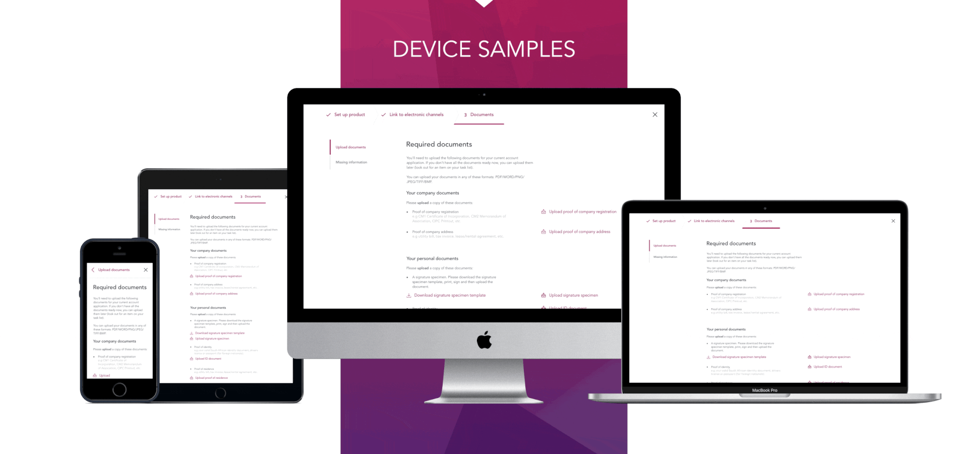
Upload required documents
This page is Step 3 of the application: Documents
Displays a list of outstanding documents the bank needs in order to fulfil the application. It consists of company and personal documents.
It displays the missing document with an upload button as well as a brief description about the type of document it might be.
Patterns include:
Upload feature (before, during and after upload is complete)
Display list (not editable)
Top and side stepper of application as well as layouts/grid
Review your application
This page is the last side step of Step 1: Product set up.
It reviews all submitted content for the application.
Information can be viewed and edited.
Patterns include:
Display list of contents (with edit feature)
Edit contents (Save or cancel)
Accordion view for multiple accounts/sections to be reviewed
Top and side stepper of application as well as layouts/grid
Calculate interest rate
This page is the second side step of Step 1: Product set up.
The goal is to calculate the interest rate for this investment product.
Patterns include:
Amount slider with minimum and maximum values
Frequency dropdown (based on similar applications)
Dynamic side panel (summary) that changes based on user input
Top and side stepper of application as well as layouts/grid
See under “Detailed design” for the web screen and some further details.
Detailed design
Because we had an established design library and design system, it made the transfer of work from paper / thought to detailed design fairly easy. This also meant some overlap with UI (User Interface design) and not just UX.
Our tool of choice was Sketch.
The important elements we needed to consider was our use of patterns and visuals to align with other projects in the bank for a seamless experience, as well as adherence to an evolving design system.

Example of investment product
Calculate my interest rate
Things to consider:
A summary section (to the left) reflects all entries as well as the calculated interest rate so that the user can see how their input affects the interest rate.
This is the 2nd step in the application, the one before chooses the investor account which will be linked to this new investment.
The “Duration” field affects other fields on this step (when selecting “monthly”.
The date of the application will populate as the start date in the “Duration” dropdown.
A dynamic interest rate is calculated and displayed to aid user understanding and provide a sense of control in the process (The “Summary").
There is a minimum and maximum amount they can invest, which is why we chose the slider as it affords the user easy understanding and constraint boundaries in which they can act.
Cannot invest for longer than 1 year.

Alternative screens
Empty landing view
All fields are empty.
Default amount is minimum of R1000.
The “day of the month” field is not yet visible.
Summary and interest rate is empty on this page.
Select duration dropdown
Display calendar view in a dropdown.
Has to accommodate disabled states, such as weekends or the maximum period of 1 year so that users don’t select those invalid dates.
Start date cannot be selected, so the range is only dependant on selecting the end date.
Alternative view if frequency is not “monthly”
“Day of month” field is not visible unless Frequency field is selected as “Monthly”.
Summary will not display an entry for “Interest payout date” as a result of the above.

Example of investment product
Select my interest payment method
Things to consider:
This is the third step in the ‘product set up’ section for this investment application.
Customer choose where the earned interest is paid.
Options are accounts with this bank versus accounts with other banks.
How to select the accounts - can we pull from database?
Cannot manually add an account, so if the account is not in the search field, then the customer would have to get in touch with their investment centre. This is not ideal but it’s the first iteration of the application. In the future a customer should be able to add an account manually.

Example of investment product
Set up my statement preferences
Things to consider:
This is the last sub step of the Product Set Up step before review.
The list of contacts is only a display, which means new people cannot be added at this stage. This was a new pattern as we’ve previously enabled “search and add” in other applications.
ID numbers should be masked in the display.
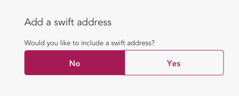
There are different ways to incorporate the “Add swift address” line, some of the design concepts are shown below.
The “Frequency” field entry is directly related to the “Day of the month” field. If “Monthly” is not selected then it would not show.

Alternative screens for including the Swift address
Yes/No button
Advantages:
You can view the Swift address before making a choice.
Uses a small amount of space on the page.
Disadvantages:
Requires a selection for both “yes” and “no”.
It’s small, so the question might be overlooked.
No / Yes switch with text field
Advantages:
It’s big, so you cannot miss the question.
Disadvantages:
Requires a selection of ‘yes’ before you see the actual Swift address. If No is selected, then the text field does not show (see below).
Yes / No toggle
Advantages:
You can view the Swift address before making a choice.
Uses a small amount of space on the page.
Disadvantages:
Users might not understand the ‘yes’ and ‘no’ part of the toggle since it’s not a text component.
If nothing is selected then it would be “no”. It might not be clear to all customers.
It’s small, so the question might be overlooked.

Example of Current account product
Upload required documents
Things to consider:
Can only support a single upload instead of bulk/multiple uploads at one time.
Only supports particular doc formats.
Split between personal and company documents.
Show examples of x of docs as different documents can be used, for example “Proof of identity”.
Template is needed for signature doc, hence a download and upload feature.
Copy
The designs were essentially online forms, consisting of a large amount of copy. These screens and contents had to be written in a customer-friendly way, whilst still aligning with the voice and tone of the bank.
Working alongside dedicated copy writers we completed not only the content itself but also getting it signed off with language services in the bank. It was a balancing act between customer, business and language best practice.
Copy reviews were completed in 2 ways:
Option 1:
Screens are updated with the copy and sent for review and sign-off. This is an iterative process of update and review until the final screens are signed off. These screens were then handed to the developers to implement the changes in copy.
Option 2:
Copy is transcribed into a word document and reviewed. Only once it is finalised, does it get updated on the design itself and then handed to the developers for implementation.
Prototypes
Prototypes were created for each of the products for the purpose of understanding flows. This included the journeys and steps mentioned in the "Information design" section.
Our tool of choice was InVision, which also became the reference for developers to code.

This application was only the start of a large range of products being built (such as Investments and other related products, like an Overdraft).