

Bank card and packaging design
A redesign of the bank cards and packaging materials based on the new Absa rebrand
April - June 2018
Responsibilities: Research, Competitor analysis, Personas, Card design (Brand & mandatory layer), Designing for packaging and stationary, Layout for print (booklet, carriers) and Technical guidelines for cards.
Context
Industry
Financial services - banking sector. South Africa.
Users
Transactional clients for the Private and Wealth segment.
Team
4 designers, 1 Creative Director & business from each segment.
Product
Bank cards and packaging.
Project timeline
The brief
To reinvent the card range with a new look and feel (that aligns to the new Absa rebranding) and to create more visual consistency between the different card segments. How can we create similarities between the Gold and Wealth card but also create a unique look for each of the segments?
We were tasked to create the Debit and Credit cards for the Wealth and Private segments.
Along with the design of the cards, we also had to design packaging, stationary and guidelines.
I worked alongside a team of designers and our involvement was only for the Private and Wealth segment. All images and content are intellectual property of Absa.
Competitor analysis
A card analysis was completed to understand the visual elements that make up a card.
Although the project consisted of transactional card design, we wanted to understand and compare not only bank and financial cards, but also other cards such as reward and store cards.
The analysis contained findings for both local and international cards.
Personas
Personas were created for the Wealth segment to better understand customers in terms of their demographic, needs, pain points, biography etc. The findings were based on research from current Absa customers and user groups within the Wealth and Private segments.
The persona shows:
Which cards they have in their wallet
How they spend their money (cash, EFT, card)
How they use their cards
Their banking experiences
Their goals and pain points, etc
Problem solving
Debit and Credit cards looked different because they were printed at different manufacturers (Colours, size of card, etc)
There is no visual reference other than the word ‘Debit’ or ‘Credit’, these labels aren’t always present either.
Information is cluttered, irrelevant or the placement varies on different cards in the range (sometimes in another segment or the debit/credit version of the same card)
Different Absa logos are used and are positioned in differently on cards.
There is no clear ‘brand layer’
Too many variations in card imagery (affinity cards such as Blue Bulls, Tuks university)
No clear imagery for the range is present
Improvements:
Removed BIN number
Left aligned embossed text
Cleaned up layout & grouping of info
Grouped stock code with supplier ID
Removed duplication of segment and card type
Cleaned up layout & grouping of info (hologram)
Decluttered info:
Removed “If found…”
Removed URL
Removed icons
Card design
There are three design layers of the card:
Mandatory
Brand
Delight

The mandatory layer deals with security and mandatory elements that are given from external suppliers that have to be included within their guidelines.
The brand layer deals with the look and feel of the elements that belong to Absa. They are in a sense also ‘mandatory’ but these are determined by Absa and not external suppliers. We have freedom to change size, colour and placement until they are finalised and become the mandatory brand layer.
Both the brand and mandatory layers are essentially the elements that belong on each card, regardless of it being a debit or credit card as well as a private, wealth or gold card. The goal was to visually streamline the brand and mandatory layers so that the cards carry more visual consistency throughout the rest of the spectrum.
The delight layer however, are the elements that make each segment unique. How does the Gold card differ from the Wealth card? That’s what the delight layer tries to bring out.
The brand layer
As mentioned, there are 3 layers to this card. Although our team was involved in creating the 3 layers, my involvement was mainly around the Brand layer.

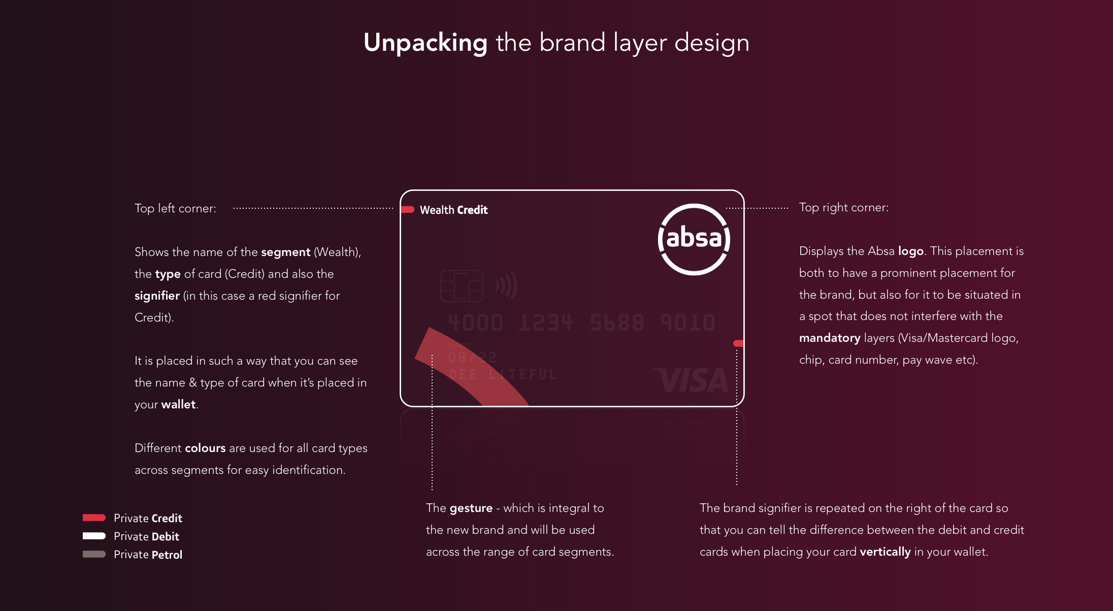

After establishing the mandatory and brand layers for our specific cards, we were conceptualising the design of other cards in the range. With the increased colour spectrum in the new branding we decided to create a specific colour range for each segment.
We looked at the colours for the Transact, Flexi, Lifestyle (previously known as Gold) and Premium cards in addition to the Private and Wealth cards we were busy designing.
These colours essentially form part of the delight layer which is coupled with a unique illustration.
Card colours consisted of:
The base colour for the front of card
Core colour of the card (the outline around the card)
The base colour for the back of card
Colour of the gesture (a gradient)
The delight layer
Our process for creating the cards began with the mandatory layers followed by the brand layer. Once these two layers were completed and formalised, we worked on the concept for the Delight layer.
The delight layer is unique to each segment. For the Private card the theme was Planetary, whilst the Wealth card represented a Galaxy - as you can see from the final product.
These themes also became the visual representation for the packaging (shown further down).
Explaining the themes:
This was representative of the customers and their journey in the card range. As they move up the card range their world view and expectations would expand.
The Flexi (entry level) card would have a microscopic image whilst the Wealth card showed a Galaxy.

Design of packaging and stationary
We also had to design packaging and stationary that carried the same visual consistency.
These items included:
booklets
letters,
letter sleeves,
card carriers,
boxes,
box sleeves & more.
Some of the above items were simply used for the launch of the new brand (such as the boxes and booklets), whilst other items would carry through the rest of the card range, such as the card carriers.


Creating the technical guidelines
Technical guidelines were created during the design of the cards to document the new standards that were being implemented on the design of the Private and Wealth cards, in order to continue the rest of the card spectrum at a later stage.
The guides also include images to simplify the content.
What are some of the guidelines?
The mandatory layer
The placement, sizes, colours etc of the items on of the card such as:
The Visa / MasterCard logos
Microchip
Personalisation (Card holder name etc)
Expiry date
CVV number
Manufacture tracking info & more
Elements that belong to the brand such as:
1. The logo
2. Brand elements
3. Card identification
4. Contact information
How was it documented?
Documentation was created in InDesign so that it could easily be updated but also to export to PDF and distribute where needed.
A second copy of the guides also live in a more colourful presentation that can be referenced as well.


