

Redesign of Zulzi grocery delivery app
A redesign of the Zulzi mobile app based on findings from a Heuristic assessment and UX audit.
Aug - Dec 2020
Responsibilities: Heuristic evaluation, User flows, Designing for Accessibility, Visual / UI design and Content development

Context
Industry
E-commerce & Groceries. Servicing South Africa.
Users
Individuals who shop for groceries and products online.
Team
2 designers, 15-20 developers and a project manager.
Product
A grocery delivery app.
What is Zulzi?
Zulzi is an online platform where you can order groceries and have those items delivered to your door within the hour. At this time, Zulzi was shifting from delivering products supplied by local retailers (such as Pick ‘n Pay, Woolworths, Clicks, Dis-Chem etc), to sourcing and supplying those products directly.
My focus was primarily on the customer App for iOS & Android devices, although Zulzi also has a customer facing website, staff facing apps for the shoppers and drivers and a portal for the merchants.
The design team
We were a small design team of 2 and the first in-house designers in the company. When we joined the project, the first iteration of Zulzi 1 was live whilst version 2 was still in progress. Version 2, which was set to go live within the following 6 months, was a complete rebuild of the app. A lot of work had been done by a previous agency which our internal team picked up to evaluate and complete for the launch date.
In order to effectively evaluate the state of the designs as they were, we decided to do a UX audit which consisted of a Heuristic assessment and also having a look at the Accessibility.
The following sections will explain UX audits, Heuristic assessments and Accessibility in more detail followed by the audit findings and the improved app screens.
What is a UX audit?
A UX audit is essentially an analysis of the design elements; the visual elements that you see on the screen, the language and even the flows themselves. The aim of the audit itself is to pinpoint areas of improvement.
How we highlighted these improvements is through a Heuristic assessment and looking at Accessibility (both explained lower down).
In addition to highlighting areas of improvement and why they are of concern, we also included recommendations to eliminate these issues and improve the overal user experience.
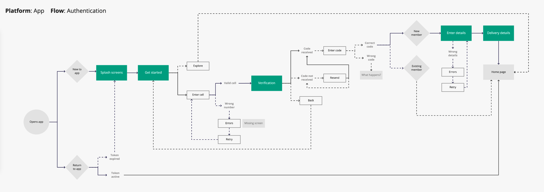
User flow
In order for us to conduct the audit, we first needed to understand what the user flow was and how everything worked together. A basic user flow was put together in order to map out the current state.
The items marked in colour on the user flow are the screens in the audit.
Heuristic assessment
Heuristics are 10 principles (we also can call them rules or guidelines) from the Nielsen Norman Group that help to identify broad usability problems in the design.
They are as follow:
Visibility of system status
Match between system and the real world
User control and freedom
Consistency and standards
Error prevention
Recognition rather than recall
Flexibility and efficiency of use
Aesthetic and minimalist design
Help users recognise, diagnose, and recover from errors
Help and documentation

Accessibility

We also evaluated the Accessibility of the mobile screens to identify elements that needed updating.
Accessibility means catering for users who have (in this instance visual) impairments or disabilities so that they’re able to use products effectively and without struggle.
How we accomplished this is by checking the size of text and components as well as the colour contrast on the screens, using the “A11y - Colour Contrast Checker” plugin on Figma.
For example, the smallest font we encountered on the mobile screens was 8px whilst the recommendation is for 14px and up.
Below examples:
Showcasing font & button colour compliance.


The goal is to achieve AAA compliance so that the content is visible to all users.
Audit findings
The audit was aimed at the entire app, but I will reference only one flow namely “Authentication” which deals with the log in and registration process of the app.
The affected screens are marked in colour on the user flow.
It was also the first section we worked on for the audit, as we felt that the entry points into the app were crucial to fix, so that users don’t experience frustrations and pain points so early on in the process.
I’l first showcase the findings for the Heuristic assessment (and some general observations) followed by the findings for accessibility.
Keygen

Splash:
We could add defined branding (and the company name) as this is the first screen the user will see. This is not a usability problem, but it could definitely be improved to familiarise new users with the brand.
Repetitive heading and paragraph, explore better use of copy.
The button sizes vary based on length of copy, we can standardise size of buttons and their placement regardless of the copy length.
[Consistency and standards]
Recommendation: Decide on a button pattern and apply it throughout.

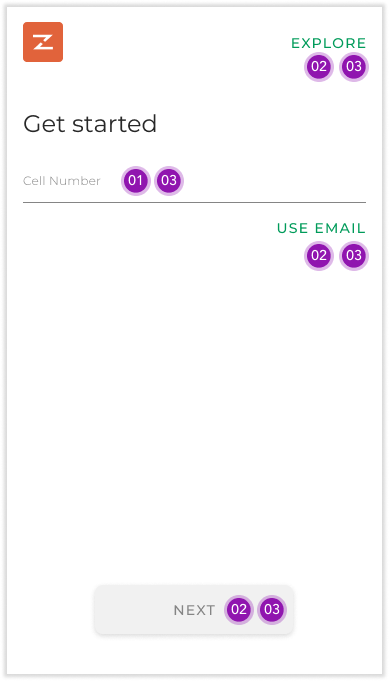
Get started:
The label “Explore” does not clearly clarify what this button does. It should help users anticipate and understand what it means to select this button.
[Match between system and the real world]
Recommendation: Look at the label copy and placement.There is a general lack of context on this screen with almost no information. We need to add more more context / clarity, especially because the heading ‘Get started’ is so vague.
[Match between system and the real world]
Recommendation: Add copy below the heading for more context. For example “Simply enter your cellphone number below in order to register for the service.”Buttons for ‘Explore’ and ‘Use Email/Cell’ are styled the same yet have different purposes and results. The one allows you to switch the log in method on this page, whilst the other allows you to bypass this flow and view the app in guest mode.
[Consistency and standards]
Recommendation: Investigate better toggling buttons and standardise how tertiary buttons are used.Page button placements differ from other app sections (some are located at the bottom of the screens whilst others sit just below the content).
[Consistency and standards]
Recommendation: Decide on a button pattern and apply it throughout.

Verification / OTP:
What happens when the user enters the wrong code?
[Help users recognise, diagnose, and recover from errors]
Recommendation: Include error messages and look at copy presented to the user.Is there a limit to the amount of times the customer has to enter the code?
[Error prevention]
Recommendation: If so, list the information upfront (potentially during the error state).The “resend code” button does not match any tertiary button styling.
[Consistency and standards]
Recommendation: Confirm pattern/library and update throughout.Inconsistent use of the disabled button in terms of size, colour and placement.
[Consistency and standards]
Recommendation: Standardise & document all buttons and apply it throughout.The Back button should be listed on top nav level to allow the customer to go back to the previous screen (which is where the number was entered).
[Consistency and standards]
Recommendation: Reference the back button used in other sections, such as “Help”.Is there an easier way for existing customers to gain entry into the app? At the moment the token expires and the user is forced to go through the entire log in process (cell number & OTP).
[Flexibility and efficiency of use (Accelerators)]
Recommendation: Don’t let the token expire or explore faster log in methods such as biometrics for return users.

Enter details:
Fields are not marked as mandatory or optional so it’s unclear to the user what’s expected.
[Error prevention]
Recommendation: Clarify which fields are mandatory and which are optional.What are the error messages? (Especially for Email and Password)
[Help users recognise, diagnose, and recover from errors]
Recommendation: Include error messages and look at copy presented to the user.What are the password requirements?
[Error prevention]
Recommendation: We should inform the user upfront about the password requirements or restrictions as to avoid them making a mistake before informing them.Try more scalable content like “By continuing you agree to the Zulzi Terms and Conditions” so that the label of the button does not affect the disclaimer content.
This is not a usability issue, but it would require rework if the button label was changed. This is also a good copy method to follow for referencing dates, for example, instead of writing “we launched two years ago” rather state “we launched in 2018”. That way, you don’t need to rework the content every year.
The user should have access to the Terms & Conditions if this is something they ‘agree’ to, even if informally.
[Help & documentation]
Recommendation: We should add a link to the Terms & Conditions from this disclaimer, even if the user only views it.

Delivery details:
Explain why the address is needed after registration and before they can access the home page, since this is a mandatory step and not clear as to why it’s needed.
[Match between system and the real world]
Recommendation: Add additional content on the page before the search feature.Active and empty state font colours are the same. This is not recommended as it causes confusion between completed and incomplete states.
[Consistency and standards]
Recommendation: Establish UI for populated and empty states of fields.It’s unclear that you need to select the populated address in order to proceed with the flow.
[Consistency and standards]
How often is the map feature used instead of search or current location?
[Aesthetic and minimalist design]
Recommendation: If this feature is rarely used, rather emphasise the search function for finding an address.“Choose on map” button does not match the tertiary button UI.
[Consistency and standards]
Recommendation: Standardise tertiary button UI and apply it throughout.
Reviewing accessibility for screen range
Text is too small: Recommend smallest size 14px but for primary text 16px and larger
Users with dyslexia will struggle with all caps, especially with longer sentences
Text colour is too light
Background colour is too light
Line height too small: Recommendation is 150% line height


Improvements

Below are the improved screens with enhancements made to fix the heuristic and accessibility issues raised during the audit.
If you’d like to view the new screens next to the originals, you can do that here.


Splash:
Inserted the full logo and made it larger on this screen
Reworked the copy
Standardised button size and placements
Fixed all accessibility issues
Get started:
Added a back button with a label
Added a paragraph below the heading to contextualise the page better
Amended button copy and placement for browsing the app as a guest
We ended up removing the requirement to alternative between email and cell for log in and registration, so we did not need to solve for the toggle button
Standardised button size and placements
Fixed all accessibility issues
Verification / OTP:
Added a back button with a label
There are no limits to the amount of times the customer can enter the code, so we did not need to mention that on the screen
Standardised tertiary button UI
Fixed all accessibility issues
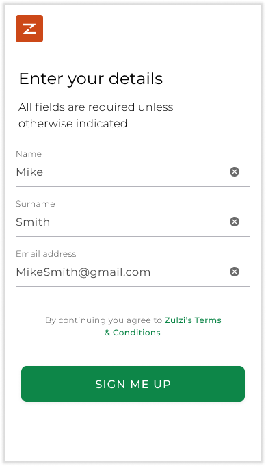
Enter details:
No back button has been added because the user cannot go back to the previous step
Added the disclaimer for mandatory vs optional fields
Passwords were removed as a business requirement, so we did not need to cater for anything regarding passwords
Amended disclaimer copy so that it’s not dependant on the name of the ‘sign me up’ button
Added a link to the Terms and Conditions page which allows the user to read or preview before finishing with their registration
Standardised button size and placements
Fixed all accessibility issues
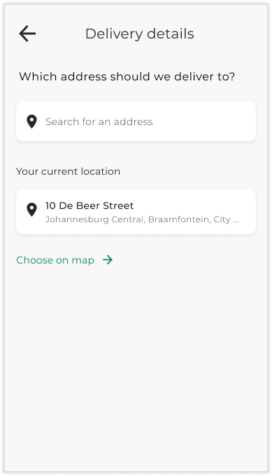
Delivery details:
Standardised the page title in the nav (versus ‘back’ buttons)
Added a paragraph for context above search field
Empty and active states for input fields have been adjusted so that the active state is darker and more defined as opposed to the placeholder text in the empty field
Standardised tertiary button UI
Fixed all accessibility issues
Side by side view of before & after screens
A quick recap of the updates that were made to the screens showcased next to the original screens.


