

Heuristic assessment of the Greenbacks app
A heuristic assessment followed by a redesign of the Nedbank loyalty & rewards mobile app.
Nov 2019 - July 2020
Responsibilities: Heuristic evaluation, Interaction design, Wireframing, Visual / UI design and Guidelines and templates.

What is Greenbacks?
Greenbacks was a traditional loyalty and rewards programme for Nedbank, but have been evolving into a behavioural money management programme. What this means is that it would guide and help customers to make better financial choices through a gamified experience.
When customers improve their behaviour, they are rewarded. The same way that Discovery rewards you for going to the gym, they would reward you for managing your money well. These behaviours are for a variety of financial elements such as transacting, spending, saving, debt repayments etc.
Below I unpack the heuristic evaluation and improvements that were made to the app. You can also read about the research and restructuring of the app menus in this project.
A heuristic assessment
During my time on the project, it became clear that the app was not optimal in terms of the user journeys and experiences.
The reason why the app was not optimal is because (a) it was an off-the-shelf product that we had altered for our new programme which did not cater 100% for our exact needs, (b) it was costly to implement changes that were not in the budget at the time and (c) we had not done any user testing on the app itself before it went live.
An optimal app experience was crucial so that customers could understand the new programme and how best to benefit from it. A heuristic assessment was completed to understand the severity and complexity of the issues we were facing, to determine the UX Debt we were sitting with and to highlight where we needed to improve first.
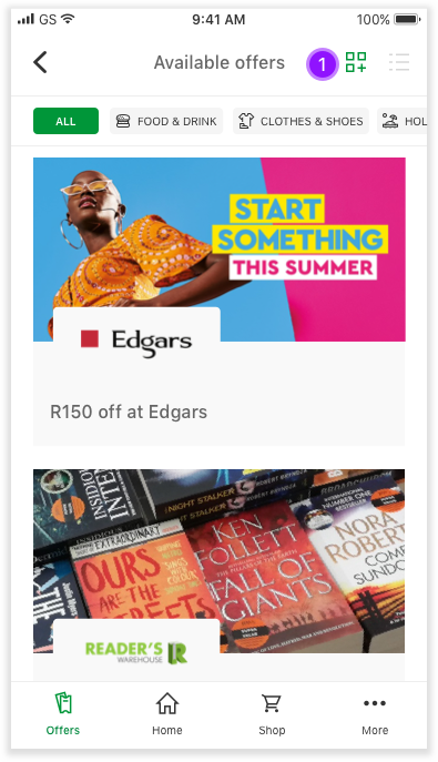
An important journey was for offers, which were some of the rewards customers received for being on the programme or taking part in improving their behaviour.
The findings for the heuristic assessment below are ranked in terms of severity. What’s important to note is that the majority of problems in the app were in the categories for Findable, Clear, Communicative and Usable.
The following sections will unpack some of the work completed for the Heuristic Assessment and some conceptual drawings for improved journeys.
Explaining some of the heuristics:
Findable
The ease with which information can be located
Are the flows and tasks familiar and natural?
Does the information architecture, search, navigation and content help guide users through the system?
Can users can locate that which they are seeking?
Are there multiple ways available to find things?
Often what is intuitive for some isn’t intuitive for all.
Clear
The ease with which a user can understand what is in front of them
Is the path to task completion obvious, and free from barriers?
What parts did they get right? What did they miss completely?
Can users easily differentiate between actions and navigation?
Is it clear what information and functionality is available at the current location?
Are the required steps or fields clearly marked?
Communicative
The information provided to users throughout their experience
Do users know where they are?
Do they understand what they can do there?
Have you prepared users for what is ahead of them?
Do they know what to expect after each interaction?
Are the task steps in a familiar natural pattern?
Is the navigational structure organised according to user needs?
Usable
Facilitates users in producing desired or intended results
Does what you have built work well for both new and experienced users trying to complete their work?
Are users still hunting around for information that will help them make informed decisions in completing tasks, or have you displayed it where appropriate?
Are users able to complete the task that they set out to do without frustration or abandon?
Read more about the heuristics.
The journey I’ll be showing below is for the Offers & Coupons in the app where the majority of fixes needed to be made.
High: Issues are critical and prevent the user from completing their desired task
Medium: Issues cause frustration but does not stop the user from completing their task
Low: The experience is not optimal and can be improved
Conceptual drawings
Viewing the current app layout with suggested updates to be made. Some aspects can be merged with another whilst others need to be removed entirely, updated or left unchanged. These have been marked as follow:

Existing Offers page

Existing Coupons page

New design concepts

New designs - digital
New designs and journeys were built to fix the heuristic issues raised. Although the UI of the screens has also been enhanced, the most significant updates were in the journeys and content itself.
Below I’ll show the flow and expand on the updates per screen lower down.
Unpacking the updates
The landing page
Allow a toggle for the customer to choose how they'd like to view the offers; list versus grid (images). When landing on this Offers page, it should default it to the grid view.
Order this list to show offers in terms of expiry and not by date loaded. Meaning, the offer that is about to expire first, is listed at the top. This is to ensure that deals about to expire are exposed to the client.
A template for the offer heading was created so that the partner name and discount is always listed while still taking into account the character limits.
Once a coupon has been used, it should be removed from this list (and grid).
For deals that don’t expire write “Always valid” for clarity.
Allow for offers to be categorised / tagged so that a customer can filter through the different types of offers we have available. This tag list scrolls from left to right. Once clicked it will only show the offers in that category instead of all offers.


Offer details page
Limit use of colour (such as the green header) on the page to only emphasise the buttons, coupon and image.
Move image to the top for more brand exposure and a more vibrant screen.
The image should consist of both the logo and a lifestyle image.
Remove the opt-in feature so that the customer has access to the coupon. Simplify the process.
Add show/hide at the bottom of the intro to reduce copy that's displayed above the coupon itself if needed.
The offer and coupon are merged into one page so that all the relevant information and the redemption itself is in one place.
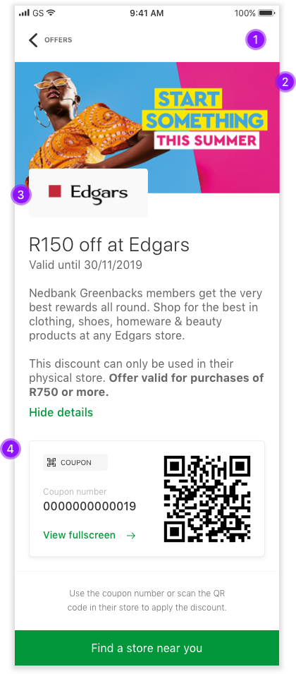

The coupons
Allow customers to see what the coupon consists of, such as the coupon number and / or QR code. In some cases there is no coupon code, which is displayed in this section - see last screen #6.
Allow customers to open the coupon in fullscreen so it's more visible and less cluttered for when they want to use it.
When viewing the coupon, include the name of the offer for context.
Clearly label and display the coupon number along with the QR code as not all stores have QR code readers.
Because this is an online redemption, the use of the QR code is not needed. Instead it relies only on the coupon number.
Nedbank Travel deals don't make use of coupon numbers. However, it is important to inform customers of this fact and not simply to leave out the coupon altogether - we are creating a standard for how offers work and what the layouts look like.
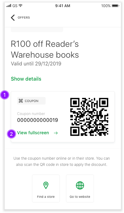


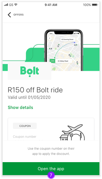
The redemption of a coupon
Add clear instructions on how the coupon can be redeemed as well as a link to that particular method. So far the redemption methods include a physical store, website, external app, call, email or a combination.
This redemption section is static so that it is always visible to the customer.
For a physical store redemption, remove the internal location capability in the app and leverage off existing apps like Google and Waze.
For a website redemption, allow the client to navigate directly to the website.
If the user has multiple navigational apps on their phone, they'll need to choose a preferred app first. If they only have one app it will simply open straight away.
Inform the client that they’re navigating outside of this app and that their coupon has been copied for easy use on the external website.


- For an external app redemption, allow the client to navigate to the app directly.
- If the customer has the app installed it should open up the home/log in screen for that application. If they don’t, it should open the app store and allow the customer to download the app if they choose.

- For a call redemption, allow the client to contact the partner directly.
- For an email redemption, allow the client to email the partner directly.
- When clicking on the call button, the number should populate automatically.
- When clicking the email button it should pre-populate a message in their default email app which they can edit before sending.


Guidelines and templates
Along with the updates to the app, we also created a guideline for images and content, specifically related to the Offers in the app.
These guidelines were important because these element are editable and managed by the internal teams. Without a standard in place, you run the risk that incorrect images and content is loaded in the app which would resurface the issues raised during the heuristic assessment.
View the guidelines and templates that we created.